Color Zoning for Small Apartments: Paint, Rugs, Furniture
Use color zoning in small apartments to separate living, dining, sleeping, and work areas without adding walls or visual clutter.
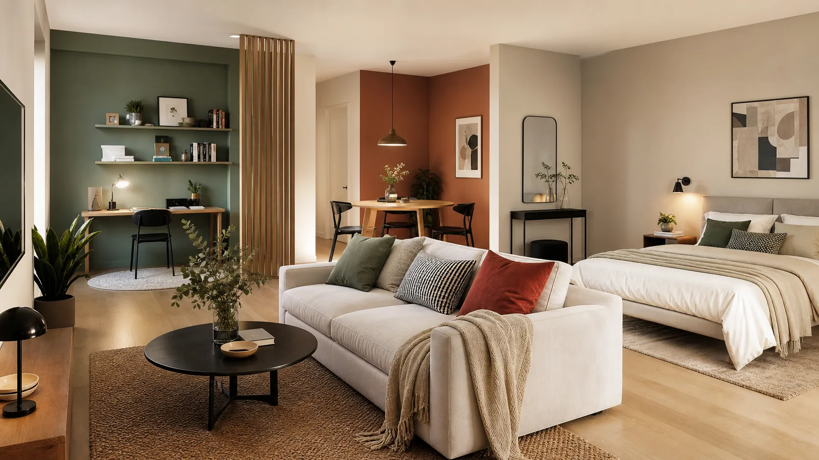
Color zoning is a useful tool for small apartments because it creates boundaries without adding walls. A slightly deeper color behind the desk, a rug that anchors the sofa, or repeated accent colors in the dining area can tell the eye where one function ends and another begins.
The risk is overdoing it. Too many colors can make a small apartment feel busy. The goal is not to paint every zone a different shade, but to create a clear visual rhythm. Test the layout first in Aedifex, then use color to support the plan.
Start with the Floor Plan
Color cannot fix a confused layout. Decide where living, sleeping, dining, work, and storage zones belong before choosing paint or rugs. Once the furniture plan makes sense, color can strengthen the boundaries.
If the sofa floats between living and dining, the rug can define the living zone. If the desk sits in a bedroom, a wall color or shelf color can mark it as a work corner. If the entry opens directly into the room, a darker runner or cabinet color can create a landing zone.
Use One Main Neutral
Small apartments usually need one calm base color across most walls and large furniture. This keeps the apartment connected. White, warm gray, soft beige, pale green, or muted clay can all work depending on light and flooring.
The base color should not be boring. It should be quiet enough that zones can stand out without fighting each other.
Pick One or Two Zone Colors
Limit stronger colors to one or two zones. For example, use muted green for the work area and terracotta accents in dining. Or use navy textiles in the sleeping area and warm wood tones in living.
Repeat each color at least twice. A single colored wall can look random. A wall color echoed by a chair, lamp, artwork, or rug feels intentional.
Rugs Are Color Zones Too
In rentals or finished apartments, rugs are often easier than paint. A living room rug, bedside runner, or dining rug can define space without changing walls.
Choose rug size carefully. A rug that is too small looks like a mat, not a zone. In the living area, at least the front legs of the sofa and chairs should relate to the rug.
Avoid Hard Stripes Everywhere
Painted arches, half walls, and color blocks can work, but they should match the architecture. Too many hard-edged shapes can make a small apartment feel like a showroom set.
Use color blocks where they support furniture: behind a headboard, around a desk, behind open shelves, or at the entry. Let other areas stay calm.
Connect Zones with Materials
Color zoning works better when materials repeat. If the dining area has black metal chairs, use a black lamp or frame in the living area. If the bedroom has oak, echo oak in the entry shelf.
This prevents each zone from feeling unrelated. The apartment should have chapters, not separate stories.
Light Changes Color
Small apartments often have uneven light. A color that looks gentle near the window may turn dull in the hallway. Test samples in morning, afternoon, and evening before painting a whole zone.
If a dark color makes the room feel smaller, use it on furniture, textiles, or art instead of a full wall.
Test the View
In Aedifex, set up the zones, then ask:
- What is the first color seen from the entry?
- Does the work area feel separate from rest?
- Does the dining area belong to the kitchen or living area?
- Do repeated colors connect the apartment?
- Is any zone visually too loud?
Color should make the plan easier to understand.
Common Mistakes
The first mistake is using a different strong color for every function. That turns zoning into visual clutter.
The second is choosing color before furniture placement. The color then highlights layout problems.
The third is ignoring existing floors, cabinets, and window frames. Color zoning must work with the apartment you have, not against it.